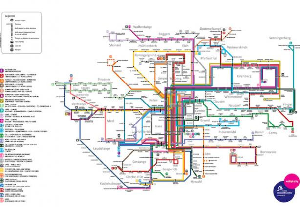
Has the Ville de Luxembourg produced “the most confusing map ever printed?” That debate was sparked by the Transit Maps blog, which last week posted a critique by Line Gustafsson, who said the new bus network map was “Luxembourg City’s spaghetti monster”.
“I hate it, the layering of lines is seemingly arbitrary,” Gustafsson said of the map, which the city unveiled earlier this month. She also stated: “This is a bit of a mess, especially in the central part where all 27 routes seem to converge without much thought as to how to arrange them efficiently along the central spine” and that “I certainly wouldn’t find this much help as a visitor!”
Cameron Booth, an Australian graphic designer who lives in Portland, Oregon, and runs the Transit Maps site, wrote: “Our rating: Using another metaphor, it’s like a pile of worms on a page, all twisted around each other. Offers little clarification of a dense network. One star.”
What makes a good transit map?
However city designers can take comfort from the fact that it did manage to avoid the site’s “Hall of Shame” and the site has issued critiques of plenty of other bus maps around the world.
Transit Maps has said the Reykjavik Excursions Bus Network map is “disappointingly average”; the Incheon Airport Bus Map is “pretty much useless”; and rhetorically asked if Venice had published a “Bus map? Or periodic table?”
On the other hand, the Sydney Olympic Park Major Event Buses map earned “three stars”; Magdeburg produced “about as German as a transit map can be. Three-and-a-half stars”; and the Hungarian capital issued an “excellent overview of transportation options in Budapest. Looks good and is easy to follow. Four stars.”
Confused?
Vox, an American news site, picked up the Luxembourg review and published the article: “This is the worst bus map ever: Is this the most confusing map ever printed?”
“I’d say it looks more like the proverbial knot that can’t be undone--and it sort of creates the impression that all of the buses in Luxembourg are constantly crashing into each other, which you’d think we’d have heard about by now,” Vox said.
The Washington-based site added: “Luxembourg is one of the Low Countries, and thus you’d probably be better off biking anyway. Better to stick with that and maybe Google Maps on your phone.” (Elevation in the capital ranges between 230m and 402m.)
On Twitter Vox readers responded that the map: “Looks like a drunken Tron racetrack”; is “puzzling indeed especially for the city centre”; and that “@transitmap Nailed it.”
New network
The Ville de Luxembourg reorganised its bus routes to accommodate major urban developments like the Hamilius revamp in the centre, growth in Kirchberg and Cloche d’Or, and the opening of the Rotondes cultural complex on the Bonnevoie side of the central train station.
The new bus routes take effect 1 June. More info about the network and the map in question can be found on the city’s website.